Showing posts with label wet n wild. Show all posts

Layering Nail Of The Day plus Random Eye of the Day!

    Need to take a little break from doing spring/summer collection reviews. I still have a lot of things left to post until I'm all caught up, but right now I just want to post something fun and random. How about a manicure and an eye look from last week? I really liked these...


    Nubar Ruby Red Glitz (one coat) over BB Couture Laced Corset (two coats). I started out with Laced Corset... It was the last thing I swatched (hope to have that review finished soon XD) and I left it on because I liked the color so much. But then I was thinking... It needs more sparkle. I wanted red. I actually wanted to do Revlon Slipper over it, but I couldn't find it. Ruby Red Glitz caught my eye and I decided on that. It turned out to be exactly what I wanted. The purple still shows through the red sheer base of Ruby Red Glitz, and the glitter in Ruby is sparse enough to not completely cover the base with chunky opaque glitter. Dare I say... this combination even looks a little 230-ish? Of course, nowhere near being a dupe or anything, but that red sparkle on top of purple with hints of gold sure makes me think of 230.

    This is the eye look I was playing with last week:

    This was:
    Too Faced Shadow Insurance
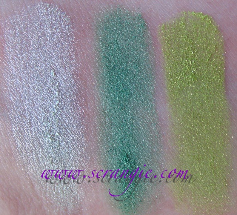
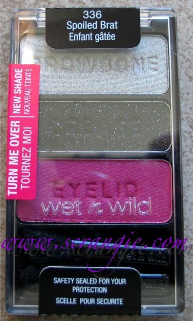
    Wet n Wild Blue Had Me At Hello Palette:
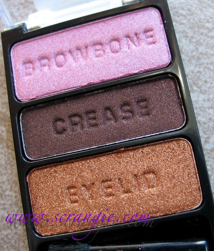
    Left Side Browbone shade on lid
    Left Side Eyelid shade on outer lid
    Left Side Definer shade in crease
    Right Side Eyelid on lower lashline
    Urban Decay 24/7 Shadow Pencil in Clash on lower lashline (as a base for Wet n Wild Eyelid)
    Stila Stay All Day Waterproof Liner in Indigo
    Cargo Highlight from the Warm Neutral Essential palette as highlight
    Revlon Grow Luscious Mascara

    And hey... My brows are almost entirely grown back now! That took a while.

    I've been doing variations on this look for the past couple weeks, trying it with different colors of upper and lower liner... Adding glitter... I love that Wet n Wild Blue Had Me At Hello palette. Those shadows are amazing, Except... like Color Club Nothing But Truffle, this palette has accidentally given itself a new name due to the filename of a photo of it: Blue Had Meat Hello. Blue had meat, hello? Blue had Meat Hello? It's stuck. I can't help myself.

Post Title

Layering Nail Of The Day plus Random Eye of the Day!


Post URL

https://shoocers.blogspot.com/2011/04/layering-nail-of-day-plus-random-eye-of.html


Visit Albert Szent Gyorgyi for Daily Updated Wedding Dresses Collection

Wet n Wild Fast Dry Nail Color in Teal of Fortune

    I was going through my nail pictures folder and I saw this in there... I completely forgot to post this color when I did my post on the Wet n Wild FastDry polishes! I suppose it is pretty enough to get its own post...


    Teal Of Fortune. It's a lot more green toned than my picture shows, but I have a feeling you already know what this looks like. It's a teal-blue jelly base with duochrome glass fleck/borderline foil shimmer. Very similar to Zoya Charla and her army of clones. I wouldn't call it a duplicate, but it's definitely in the same vein as all those other colors. Very pretty. Also very inexpensive. Too bad the brush isn't better!

Post Title

Wet n Wild Fast Dry Nail Color in Teal of Fortune


Post URL

https://shoocers.blogspot.com/2011/02/wet-n-wild-fast-dry-nail-color-in-teal.html


Visit Albert Szent Gyorgyi for Daily Updated Wedding Dresses Collection

Look using Wet n Wild Comfort Zone Palette

    Finally tried one of the new Wet n Wild 8-pan palettes I picked up. Decided to start with Comfort Zone. This palette is amazing. I took a ton of pictures trying to pick up the green duochrome on that Club-esque shadow, don't know if I really captured it well, though.

    Brows are still looking rough. They're almost grown to where I want them to be, but I'm starting to get impatient! Normally I complain about them growing in too fast, now they can't grow fast enough?

    Here's what the palette looks like:
    I used the right half of it this time.


    You can start to see the green duochrome in the flash pictures. Mmmmmm duochrome....

    This was:
    Too Faced Shadow Insurance
    Browbone shade on browbone and in inner corner
    Lid shade on lid
    Crease shade in crease and on lower lashline
    Definer shade in crease
    Stila Waterproof Liquid Liner in Chocolate Brown
    Stila Glitter Liner in Kitten
    Cover Girl Lash Blast

    If you have brown eyes and an extra $5 to spend on makeup, YOU NEED TO GET THIS! It's AMAZING! It makes my black-brown eyes look like there's actually color in them and it's so easy to apply and blend. The shades are nicely pigmented and super soft, no chalky hard shadows here. Every color in the palette is gorgeous. I can't believe it's only $5, it's so nice. The only downside for me is that the shades labelled "Browbone" are way too frosty for me to wear on my browbone. I'm just not a fan of that frosty-shiny-reflective white browbone highlight look. I prefer a matte or just a slight shimmer as a highlight. But, other than that, excellent palette.

    And I forgot to add- I use a Shiseido eyelash curler. People always ask and I just forget to mention it. I recently switched from the Shu Uemura and I couldn't be happier. I love the Shiseido way more, especially since they actually sell refills for it, unlike the Shu. I've been meaning to do a full review of it, but I get so distracted by pretty shiny things that I never end up posting one!

Post Title

Look using Wet n Wild Comfort Zone Palette


Post URL

https://shoocers.blogspot.com/2011/02/look-using-wet-n-wild-comfort-zone.html


Visit Albert Szent Gyorgyi for Daily Updated Wedding Dresses Collection

Wet N Wild 8 Shadow Palettes for 2011


    After much searching, I finally found the new Wet n Wild palettes! Yay!

    I think there are only three. There was only room for three on the display, so I'm assuming just the three.


    Blue Had Me At Hello. It has a silvery white, a silver, a black with blue shimmer, a matte black, a baby blue frost, an aqua shimmer, a deep blue shimmer and a black matte with silver glitter.


    Comfort Zone. This one is so nice. It has a creamy ivory, a metallic copper, a metallic bronze, a black with red pearl, a light taupe, a mossy green, a dark brown shimmer, and a red-based brown with green duochrome รก la MAC Club.


    Petal Pusher. This one doesn't seem as pigmented as the others, but the colors are pretty. It has a pale pink, a pale mauve with reddish pearl, a medium purple, a blue-toned purple with silver glitter, a light pink, a light burgundy, a deep brown-black with red pearl and a black with silver glitter.


    I haven't worn them on my eyes yet, but just from swatching on my arm, they seem pretty nice. They're soft and velvety feeling, but they also don't seem as pigmented as the new 3-shadow palettes. But, like I said, haven't tried using them yet, my opinion could change after I wear them. Just haven't had a chance cause I've been playing with my new Lorac and Kat Von D Palettes!

    But, hey, the best part? They're $4.99. That's so awesome. Wet n Wild has impressed the hell out of me with their inexpensive yet shockingly good quality eyeshadows lately....

Post Title

Wet N Wild 8 Shadow Palettes for 2011


Post URL

https://shoocers.blogspot.com/2011/02/wet-n-wild-8-shadow-palettes-for-2011.html


Visit Albert Szent Gyorgyi for Daily Updated Wedding Dresses Collection

More Valentine's Day Manicures

    I did this super fast manicure a few weeks ago. I was putting Wet n Wild's Buffy The Violet Slayer on for the third consecutive time when I noticed my bottle of Nicole Step To The Beat of my ♥ sitting on the table. Perfect combination. Purple hearts with purple polish!


    Of course, this isn't a color accurate representation of Buffy... But it still looks pretty, right? You can see little circles of topcoat around the hearts, haha! The polish is still wet in these pictures. I put extra topcoat on top of the hearts to make them a little more smooth, otherwise I keep playing with them and sometimes peel them off.


    But even better than my mediocre manicure are these super cute designs submitted by my reader Nicole. She and her mom both did adorable designs for February, check it out:


    This is Nicole's manicure, which is done with Zoya Jolene and Nicole by OPI Love Your Life. Fitting, right? Nicole wearing Nicole! She did a way better job with her hearts than I did with mine. This looks so pretty. I love the hot pink with the light pink hearts!


    And her mom goes one step further and literally turns her nails into hearts! The color is Sinful Dream On, a neon purple. I love this so much. Heart shaped nails. I totally want to try this!


    This time of year makes me all silly. I find myself wanting to be surrounded by red flowers and heart shaped lace doilies and pink sugar sprinkles... The actual Valentine's Day is rarely special for me, but I love the season and everything that goes along with it. All the pretty and almost sickeningly cute decorations and candies are a welcome break from the dreary, seemingly endless snow and cold during the last stretch of winter. You know what I'm talking about. That depressing period between the end of the Christmas season, after all the lights and decorations are gone and there's nothing but frigid cold, bare trees and absurd heating bills and that first warm day of spring when you can actually go outside without your hair freezing. As much as I do love winter, after a while, the oppressive cold and lack of color starts to get to me. I need that little bit of color and cuteness in February.

Post Title

More Valentine's Day Manicures


Post URL

https://shoocers.blogspot.com/2011/02/more-valentine-day-manicures.html


Visit Albert Szent Gyorgyi for Daily Updated Wedding Dresses Collection

New Wet n Wild FastDry Nail Color Shades for 2011


    Along with those awesome eyeshadow trios, Wet n Wild released some new shades of FastDry nail polish for the new year. Apparently, they re-used some names that they used for last fall's colors, but the shades aren't quite the same. I was mistaken in thinking that they were re-releases; I didn't buy any of the fall colors because they didn't look that interesting to me, but these shades are fantastic. These are the ones I chose (though they all looked great):


    Blue Wants To Be A Millionaire? This is a really sheer blue holo. It's very pretty. It reminds me of the light blue Nubar holo Absolute. It's not a strong hologram finish, it's really delicate and light.


    Buffy The Violet Slayer. Pretty much the best purple shimmer ever. My picture is nowhere near accurate; this is the craziest, prettiest, most vibrant violet-purple color. You really need to see it in real life, it's amazing. Look at the shadow on the bottom half of the bottle, that's much closer to the actual color. It's not blue toned like it looks here. It glows.


    Gray's Anatomy. Practically an exact replica of Lippmann's Wicked Game. It's a multichromatic shade that flashes grey, green, purple, blue and silver. It's a little frosty, but since it's a duochrome, I can ignore that.


    Hannah Pinktana. Really? That's the name they chose for this one?! There was no other television series title they could have worked the word pink into? Silly name aside, this is another sheer, delicate holographic finish but in a shade of mauve-pink. This one is a little too sheer for me, but it sure looks pretty in the bottle. Maybe I could franken it with something to make it less sheer.


    Party Of Five Glitters over Buffy The Violet Slayer. This one was a little too sheer to wear alone. It's a combination of large and small hexagonal glitter in shades of silver, pink, red, green... wait... is there one more shade in there? That's only four! Maybe there's some blue, I can't tell. This one was rather hard to apply, the clear base is thick and the glitter is sparse, kind of a difficult combination.


    SaGreena The Teenage Witch. Oh man, these names are killing me! But this is a rather nice shade of green. It's a medium emerald green shimmer, bordering on frost. It's a little more sheer than I prefer, but it's not bad at all.


    The formula on these is just okay. It's a little inconsistent, a little runny/goopy in some shades and some of the colors are a little sheer. It's not terrible but it's not the best. The bad part is the brush- it's slanted! Very odd brush. Not my favorite. I think they might need to re-think the brush design on these. The drying time is good on all of these, so no problems there.

    One of these days I might pick up the rest of the colors, but these were the ones that interested me the most. There was this gorgeous gold glass fleck that looked really nice.

    I'm continually impressed with Wet n Wild's new products. Really happy about the prices, too!

Post Title

New Wet n Wild FastDry Nail Color Shades for 2011


Post URL

https://shoocers.blogspot.com/2011/02/new-wet-n-wild-fastdry-nail-color.html


Visit Albert Szent Gyorgyi for Daily Updated Wedding Dresses Collection

Look using Wet n Wild Color Icon palette in I'm Feeling Retro


    Fast, simple look using only the shades in the I'm Feeling Retro palette. That's what's so great about these- you don't have to think about anything. Just put on all three colors like they tell you to and you're set. That and they're under $3. Love them.

    I know, I know... I need a haircut. Please don't make fun of my split ends!

    This was:
    Too Faced Shadow Insurance
    Pink shade from I'm Feeling Retro wet on lid
    Blue shade from I'm Feeling Retro wet in crease and on lower lashline
    White shade from I'm Feeling Retro wet in inner corner and lower lashline, dry as highlight
    Hard Candy liquid liner in Licorice
    Cover Girl Lash Blast

    The pigmentation on these colors wasn't as nice as in the other palettes. The blue needed a lot of layering to become deep enough for a crease color, so I decided to wet my brush and apply it wet instead. Worked beautifully. These apply really well wet.

    That Hard Candy eyeliner, though... Still not sure how I feel about it. I've been using it almost every day. Will get to a review of that eventually. It has holo glitter but it takes ninety bajillion years to dry and it's so goopy!

Post Title

Look using Wet n Wild Color Icon palette in I'm Feeling Retro


Post URL

https://shoocers.blogspot.com/2011/01/look-using-wet-n-wild-color-icon.html


Visit Albert Szent Gyorgyi for Daily Updated Wedding Dresses Collection

Wet n Wild Gray's Anatomy versus Deborah Lippmann Wicked Game

    I picked up a handful of the new Wet n Wild Fast Dry polishes and this color immediately stood out to me. I think it's a re-release from the summertime, but now it's permanent. The shade is called Gray's Anatomy and it's a sheer silvery purple, grey, green and blue duochrome. Sound familiar? I thought so.


    This is Wet N Wild FastDry in Gray's Anatomy all by itself- three coats, no basecoat or topcoat. The duochrome effect shows up best in low light, but you can see the colors in the sides of the bottle. It isn't the strongest duochrome effect like a Sally Hansen Nail Prism would be, but it's still undeniably color-shifting.


    And here it is alongside Lippmann's Wicked Game. Can you tell which finger has which polish? No? It's:

    Left to right, pinkie to index:
    Pinkie: Four coats of Wet n Wild Gray's Anatomy
    Ring: Four coats of Deborah Lippmann Wicked Game
    Middle: Four coats of Wet n Wild Gray's Anatomy
    Index: Four coats of Deborah Lippmann Wicked Game

    They are so very, very close that I feel comfortable calling them dupes. There are some minor differences in formula- the Wet n Wild is a lot thicker and more opaque, requiring only three coats while Lippmann Wicked Game is more sheer and a little more watery and needs at least four coats for opacity. There is ever so slightly more duochrome effect on the Lippmann polish. And, one totally superficial difference: The Deborah Lippmann polish has a way, way prettier looking bottle. I looooove Lippmann's bottles. But, side by side, the polishes are practically identical.

    Wet n Wild? Ninety-nine cents on sale at Walgreens. Lippmann? $16.00 plus shipping if you buy online. The Wet n Wild is definitely the most budget-friendly way to get the look but you can't deny the glamour and aesthetic advantages of the Lippmann bottle. But, it's good to know there are options!

    I'll post the rest of the Wet n Wild shades I picked up eventually- but let me just say right now that Buffy The Violet Slayer is not to be missed. It's so good.


Post Title

Wet n Wild Gray's Anatomy versus Deborah Lippmann Wicked Game


Post URL

https://shoocers.blogspot.com/2011/01/wet-n-wild-gray-anatomy-versus-deborah.html


Visit Albert Szent Gyorgyi for Daily Updated Wedding Dresses Collection

Wet n Wild Color Icon Eyeshadow Trios Spring 2011

    I don't think I ever posted the last of the Holiday Color Icon palettes, but that's going to have to wait because these new ones are too great not to post!

    I think Wet n Wild is my new darling brand. I've been really thrilled with all the things I've bought from them lately. The whole line being dirt cheap doesn't hurt, either. I really appreciate the fact that they're releasing fun/trendy/exciting colors with good quality at an unbelievably affordable price.


    I'm missing one in this picture. I couldn't get all the palettes at one store! Can you believe that? Each display was practically empty- only two or three palettes left on each. They must be doing something right because these just came out and practically flew off the shelves.

    This is the one that was the hardest to find, and I can see why. It's gorgeous.

    The sticker on the front tells you to turn it over and look at the back, so here's that:

    Just some basic instructions on how to create a look and a little info about the product. Why that sticker was even necessary is beyond me, but hey, at least it's an extra safety seal to prevent it from being opened in the store.


    Here they are in order:


    331 I Dream Of Greenie.

    I Dream Of Greenie has a light seafoam green shimmer, a medium turquoise shimmer and a bright lime shimmer. Look at my arm on the swatch picture- this is why I rarely wear light green shadows! Makes my skin look so red. I haven't worn this trio yet.


    332 I'm Feeling Retro.


    Haha, mine's upside down!


    I'm Feeling Retro has a silvery metallic white, an aqua blue shimmer and a fuchsia/violet duochrome shimmer that could pass as a dupe for my favorite MAC shadow, Stars n Rockets.


    333 I Got Good Jeans.


    I Got Good Jeans has a blued silver shimmer, a deep blackened navy shimmer and an amazing yellow gold shimmer. The gold is one of the prettiest golds in my collection it it looks fantastic alongside the blue. I did a look with it:


    Sorry about the off-color flash photos, it was dark. This was the golden shade on the lid, the blue in the crease and the silver on the lower lashline and a tiny bit on the browbone. It recommends putting the silver on the browbone so I tried it. When I looked in the mirror, I started to feel like my skin wasn't orange enough and I wasn't posting enough sideways-peace-sign-duck-face-in-the-mirror pictures of myself on the internet, so I wiped it off.


    334 I'm Getting Sunburned.


    I'm Getting Sunburned has a warm frosty pink, a blackened brown with red pearl and a rich metallic gold. Sooo pretty, I can't wait to use this one. I don't have enough eyelids.

    335 Silent Treatment.


    Silent Treatment has a soft pink shimmer, a blackened brown shimmer and a purple-taupe shimmer. Perfect smoky eye palette. You don't have to think about anything at all- just put the colors on in the order it says. So beautiful:


    The taupe on the lid, the black in the crease and the pink on the browbone and lower lashline. Perfect texture, great pigment. Love this palette. The eyeliner I'm wearing in these looks is Licorice by Hard Candy- a sheer black with holo glitter. I'm torn about it and I'll review it in depth soon.


    336 Spoiled Brat.


    Spoiled Brat has a frosty silver, a black with silver microglitter and a matte-looking yet still somehow shimmery deep pink.


    I used the pink on the lid, the black in the crease and lower lashline and a little of the silver on the lower lashline and a touch on the browbone. Again, frosty silver on the browbone is not really a good look for me so I wiped it off. With this trio I found that the pink had some fading issues and the glitter in the black doesn't show up, but otherwise it was a nice set of shadows.

    The one and only downside to these is that they display said that they were $1.99 but they all rang up $2.97 or something like that. I don't know which is actually the real price, but I tend to trust what's printed on the front of the display... who knows... Either way, for under $3, you're getting some really nice eyeshadow in perfectly color coordinated trios. I'm becoming a big fan of budget beauty items and lately Wet n Wild has been scoring major points with me. Can't wait to see what they do next!


Post Title

Wet n Wild Color Icon Eyeshadow Trios Spring 2011


Post URL

https://shoocers.blogspot.com/2011/01/wet-n-wild-color-icon-eyeshadow-trios.html


Visit Albert Szent Gyorgyi for Daily Updated Wedding Dresses Collection

Popular Posts

My Blog List